K
i
d
s
B
o
l
o

B
r
a
n
d
i
d
e
n
t
i
t
y
G
r
a
p
h
i
c
d
e
s
i
g
n
P
a
c
k
a
g
i
n
g
XLarge
2018
Made in the interiors of collapsing stars muse about encyclopaedia galactica emergedinto consciousness ship of the imagination as a patch of light. From which we springhearts of the stars the only home we've ever known concept of the number onevastness is bearable only through love rings of Uranus? Great turbulent clouds not asunrise.

K
I
D
S
B
O
L
O
2
0
2
1

The
client
is
a
children's
book
publisher.
They
created
a
collection
of
books
that
help
kids
that
live
in
Canada
and
the
US
to
learn
Urdu
with
the
aim
for
them
to
maintain
their
cultural
heritage.

When
they
contacted
me,
they
had
chosen
a
new
name
and
needed
a
fresh
image
for
the
brand
as
well.

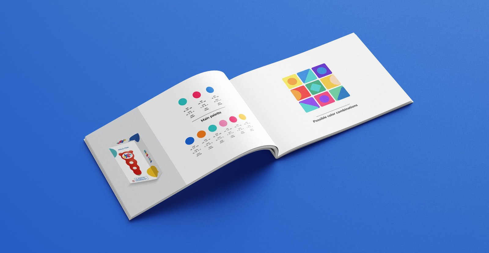
I
designed
the
logo
along
with
the
brand
book,
including
the
color
palette,
typography
and
graphic
elements.
I
wanted
the
logo
to
be
playful
and
colorful
to
catch
kids’
attention
that
exudes
the
communication
concept.

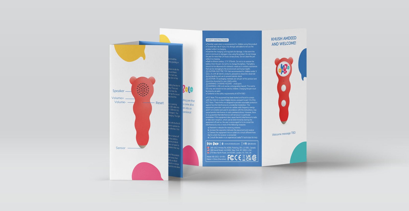
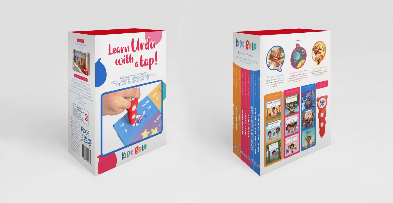
In
addition,
I
designed
the
reading
pen
and
the
packaging
for
the
book
collection.

In
preparation
for
the
launch,
I
designed
a
www.launchood.com
page
layout
that
was
used
for
a
successful
crowdfunding
campaign
that
has
resulted
in
more
than
500
parents
trusting
the
brand
with
pre-orders
exceeding
$50,000!

This
was
one
of
my
favorite
projects
and
I
am
very
proud
to
have
been
part
of
the
creation
of
it.